Bad Idea: Mis-Patterning the Tongue
My fundamental, eventually fatal error with this pair seems came down a patterning flaw where the tongue meets the vamp, under the quarters. It was bad as drafted, then got worse through both closing and lasting.
Most basically, I drew the concave tab on the vamp for the tongue attachment too far forward, right between the tabs. I also drew it too short, as a narrow, crescent-moon shape, not extending far enough back between the quarters. I also made hard, right-angle cuts on the vamps where the tongue tabs met the seam allowances for the vamp-quarter seams. It all set up for tears.
It also would have helped to do additional stay stitches further up from the vamp-quarter seams, rather than just rely on multiple rows of stitching in the vamp-quarter seams.
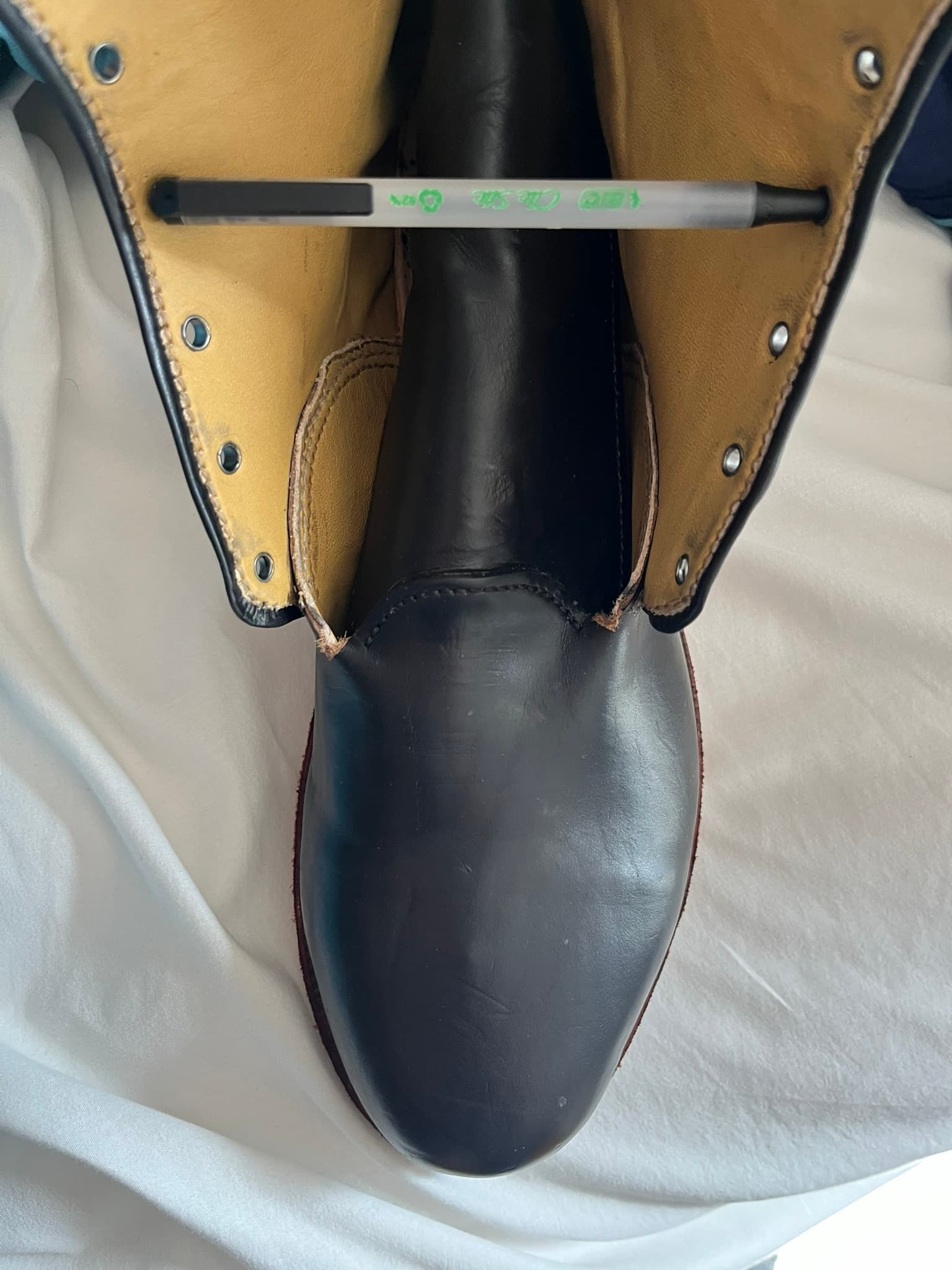
Here’s the left side, by far the worse of the two. This shot really brings home just how bad a job I did fitting the quarters before closing.
For comparison, here’s a pair of secondhand Allen Edmonds boots that I should have used more of for reference:
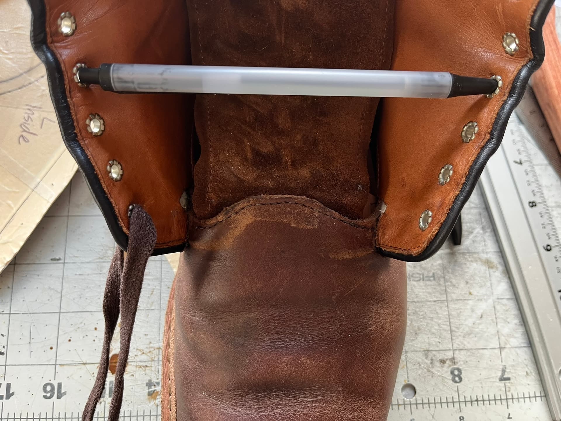
Note the scallop- or wave-like shape of the tongue tab. It’s still very narrow, but it’s curved to avoid sharp corners. There are ugly, circular gaps where the lining doesn’t cover the quarters. But they’re hidden way back, where they’ll only be seen spreading the quarters unnaturally apart like this.
The Pacific Northwest boots I’ve seen all have much taller tongue tabs. The gusset tongues hide them from the outside, but you can see the shapes in their videos:

Fundamentally, I need to be more systematic about how I pattern this area, including the linings. I also want to try punching a small locating hole in each piece that I can use to make sure everything gets fit up right. The Seidich Uppermaking book mentions this a few times.